Team project / Vehicle interaction
MORE Human Interface
A dashboard for an electric mobility platform, designed with a student engineering team so every visual the driver needs stays within reach, for the MORE modular vehicle.
A dashboard for an electric mobility platform, designed with a student engineering team so every visual the driver needs stays within reach, for the MORE modular vehicle.
Overview
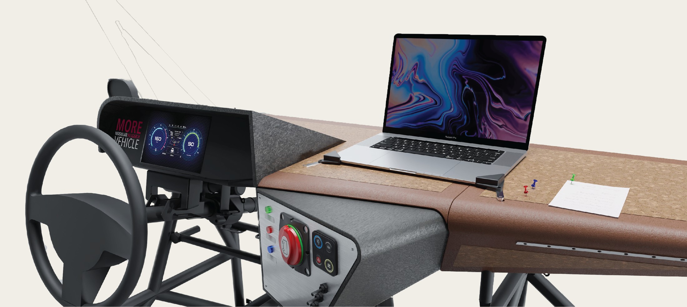
MORE is a modular electric vehicle built by a multidisciplinary HAN student team. My part was the human interface: the dashboard and console the driver actually touches, steering wheel, gauge cluster, emergency stop and controls, laid out so every one of them stays within easy reach while driving.
The brief came from the vehicle's flexible-use ambition: a modular platform still needs a driver's space that reads clearly at a glance, nothing the driver needs should require hunting across the dash for it.
That's designing with purpose in a literal sense: every control sits where the driver's hand or eye already goes, instead of the layout being decided by where parts happened to fit.
Getting the reach and sightlines right happened through physical mockups long before the CAD was final, because sitting behind a full-size mockup tells you more about what's actually within reach in five minutes than a simulation does.
Process
This ran as a full team process end to end, research, sketching, concept selection with a senior engineer and stakeholders, 3D development, and a working prototype presented to the school and interested companies.
We started with materials, current design trends, relevant laws and regulations, and general insight-gathering, before touching a sketch. Rice husk composite and metal were both new materials for me on this project, figuring out what they could and couldn't do shaped what the console was allowed to look like.
With the research settled, sketching was where we could actually explore directions, different console layouts and control placements, all aimed at keeping everything the driver needs within immediate reach.
After collecting enough concepts, we sat down with the senior engineer and stakeholders to narrow it down to three strong ideas, then developed those further into 3D models, working through the critical connection points and how the whole assembly would actually come together.
Once we had enough clarity, we selected one final design and built the first prototype, alongside high-quality renders to visualise the finished product. Prototype and renders together let us present the project to the school and to interested companies in a professional way.
01, Everything within reach
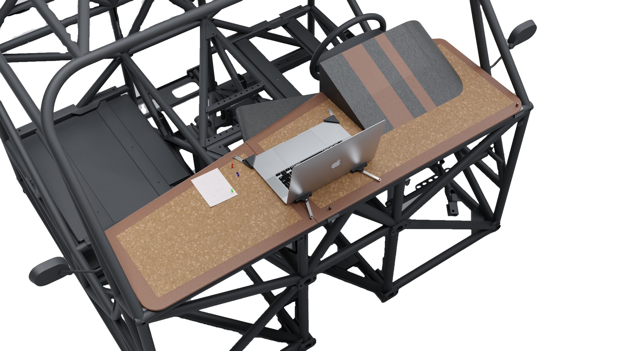
Steering wheel, gauge cluster, emergency stop and controls all sit inside the same reach zone, so the driver never has to look far or stretch for something mid-drive. Keeping the whole interface in one reachable cluster, instead of spreading it across the dash, kept the layout closer to what "modular" was supposed to mean in the first place.
02, Built for the platform, not a render
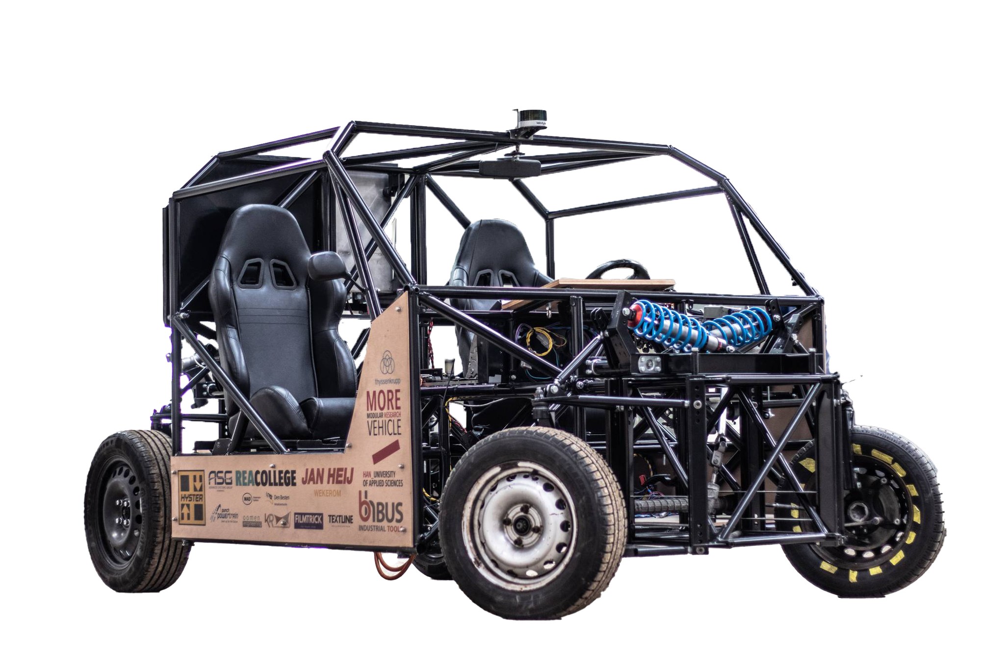
This wasn't designed in isolation, it had to bolt onto an actual tube-frame chassis built by the rest of the team, with real mounting points, real sightlines and real space constraints. Working with metal and rice husk composite for the first time meant a fair amount of the design was figuring out what those materials would actually let the console become.
Detail
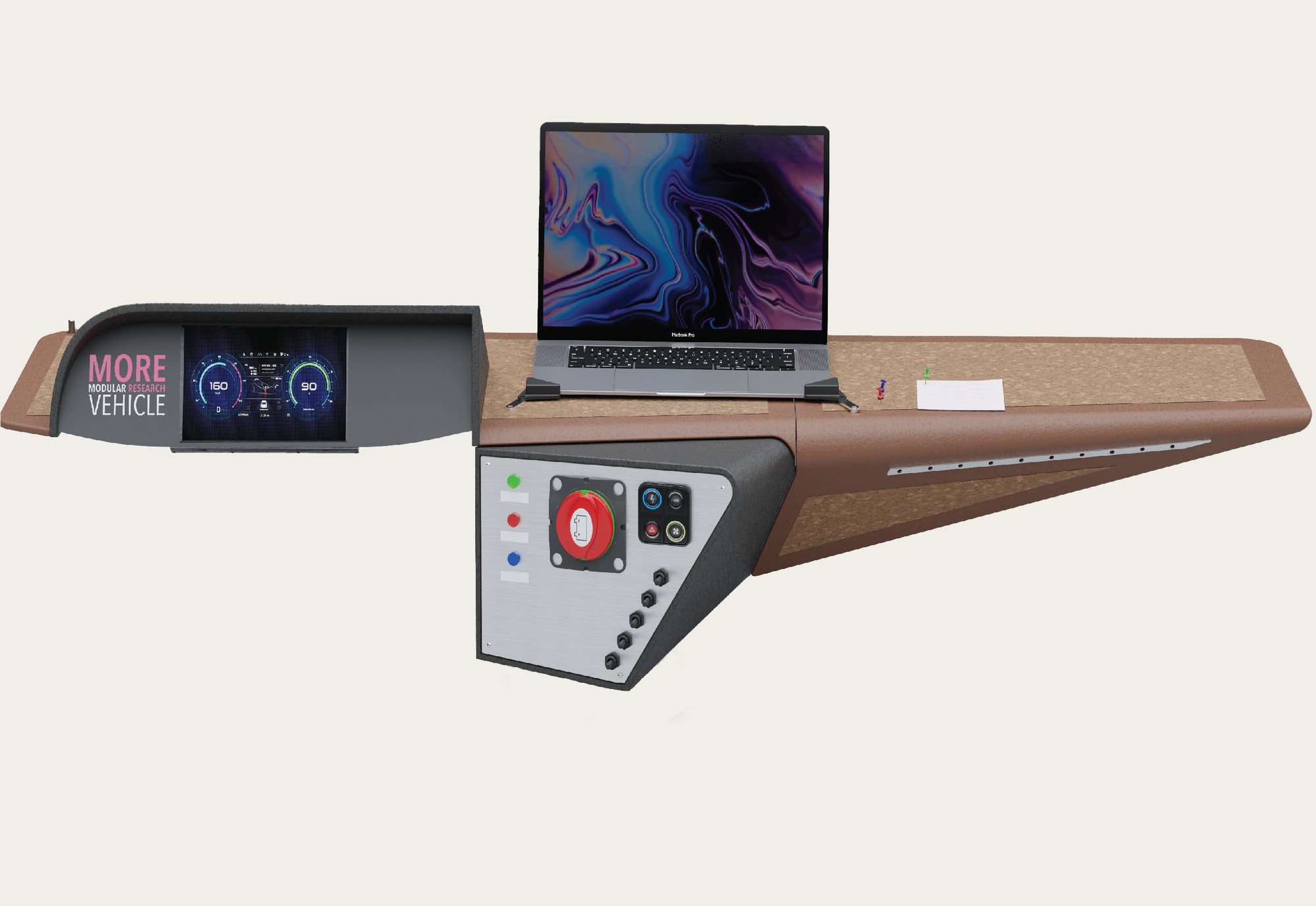
Three spots on the console worth a closer look, click a marker.
All the info, within reach
The gauge cluster puts every reading the driver needs directly in view, nothing to look away for.
Speed, drive mode and battery state all sit on the same panel instead of being spread across the dash.
Live measurements while driving
This laptop mount is fixed to the dashboard so the team can log measurements while the vehicle is actually moving.
Data collection happens during the drive test itself, not from notes taken afterwards.
Cork for grip and pinboard
The rice husk base is topped with a flat layer of cork, giving the laptop grip so it doesn't slide while driving.
The same cork surface doubles as a pinboard for notes and paper, visible here held down with a pushpin.
Gallery