Team project / Inclusive design
Festival Toilets
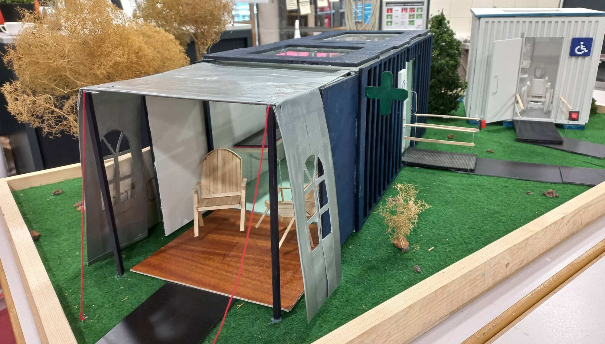
A fully accessible sanitary unit for festivals, designed with an interdisciplinary student team to close the accessibility gap wheelchair users run into on almost every festival terrain.
A fully accessible sanitary unit for festivals, designed with an interdisciplinary student team to close the accessibility gap wheelchair users run into on almost every festival terrain.
Overview
Our aim was to improve festival accessibility for wheelchair users through a genuinely usable sanitary facility, not a compliance afterthought bolted onto an existing design. Working with experts across disciplines, the team identified the key challenges wheelchair visitors face at festivals and developed three concepts, narrowed down to two, before settling on one integrated unit built around essential facilities.
We built and tested physical scale models to see how the design would actually sit and function on a real festival terrain, and closed the project with a short video explaining the problem and showing our solution in context. It's a project that underlined how much interdisciplinary teamwork matters when you're tackling a genuinely societal problem rather than a purely technical one.
Testing with physical models instead of trusting the drawings is the hands-first value in action here: you can't judge whether a wheelchair actually clears a doorway from a render, only from something you can wheel through.
Every decision traced back to one question, does this close the accessibility gap for the person actually using it, rather than tick a compliance box, the same purpose-first thinking behind everything else in this portfolio.
Process
We treated this as a research problem before it was a design problem, the accessibility gap had to be mapped honestly before we could design anything to close it. Click through the four stages below.
We started with research into how festivals are currently organised, what problems wheelchair users actually run into, and where the biggest accessibility gaps sit. We broke a typical festival visit into stages, arrival, moving around the terrain, food and drinks, sanitary facilities, watching performances, to pin down exactly where things go wrong.
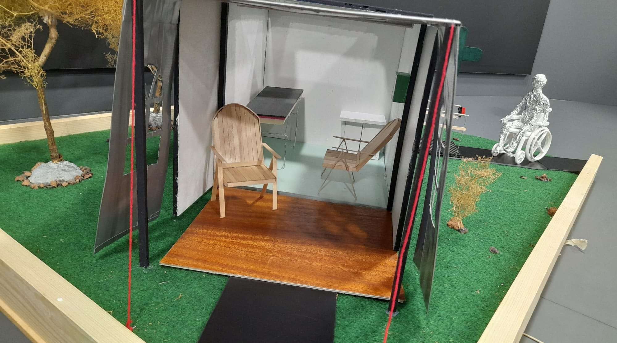
Working in an interdisciplinary team gave us a wide spread of perspectives. Through brainstorming, sketching and feedback rounds we developed three concepts, from a single fully-accessible sanitary unit to a broader rest area with more comfort-focused facilities. After testing the ideas against real constraints, we narrowed it down to two directions worth developing further.
Both directions were turned into scaled physical models so we could actually see how they'd sit and function on a real festival terrain, door widths, ramp angles, turning circles for a wheelchair, sightlines from inside. Building physical models caught problems flat renders never would have shown us.
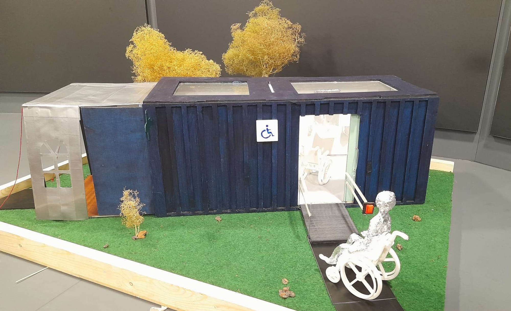
The result is a self-contained accessible sanitary unit: a ramped entrance, a full turning circle inside, and fittings placed at wheelchair height. We closed the project with a short video showing the issue and our solution in context, and presented both concepts to the client. The project taught the whole team the value of designing with the actual user, not an assumed one, in mind.
01, Entrance first
Nothing about the unit works if the entrance doesn't. The ramp angle, the door width, and the clear space needed to turn a wheelchair around inside were the first dimensions we fixed, every other design decision, including the exterior shape, had to work around those constraints rather than the other way round.
02, Fittings at wheelchair height
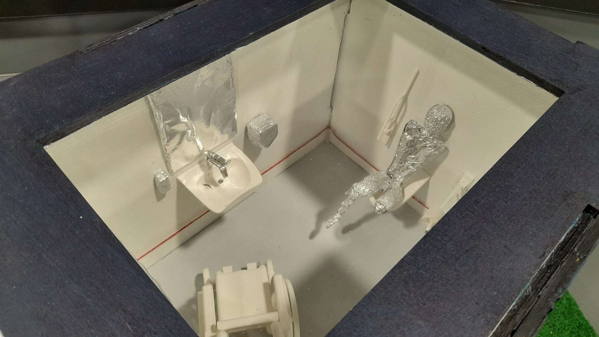
Sink height, mirror placement, grab rails, and the position of the toilet itself were all set from a seated reference rather than adapted afterwards from a standard layout. It's a small shift in starting point that changes almost every dimension in the room.
Detail
Three spots on the scale model worth a closer look, click a marker.
Seated eye-line, not standing
Sink height and mirror placement come from a seated reference, not a standing one adjusted afterwards.
Starting from a seated eye-line changes almost every dimension in the room, not just the obvious ones.
Sized to accessibility standards
Toilet height, rail position and the space around them follow standard dimensions set for people with reduced mobility.
This isn't a guess checked against one figure, it's built to the same measurements an accessible bathroom would have to meet.
Turning circle, drawn in
The red line marks the clear space needed to turn a wheelchair around inside the unit.
That clearance was one of the first dimensions fixed, everything else, including the exterior shape, had to work around it.
Gallery